

A sketch-style tattoo differs from other illustrative designs because the artist deliberately leaves visible construction lines and open hatching instead of smoothing them out, making the motif look as if it has been captured in the middle of being drawn rather than as a finished illustration. This article explains exactly how this aesthetic differs from illustrative and fine-line styles, which motifs work well with this texture, and how to check whether dense hatching will remain legible at its actual size and in its intended placement on the body before treating your choice as final.
- Sketch style is based on visible construction lines and open hatching, rather than smooth, even shading.
- It differs from illustrative style in that it lacks a clean, enclosing outline; it differs from fine line in that it uses hatching where fine line relies on a single, uninterrupted stroke.
- More densely hatched motifs, such as line portraits, animals in motion, or symbolic objects, need enough space so the individual lines do not merge.
- It is worth checking the actual size and legibility of the texture with a temporary print at the intended scale, in natural light and while the relevant part of the body moves normally.
What sketch style in tattoos actually means
Sketch is a style in which construction lines remain visible and sometimes even cross one another, rather than flowing together into a single clean outline. The artist leaves traces of the drawing process itself: an initial guide to the shape, adjustments to the direction, small turns in the stroke. Instead of smooth, diffused shading, there is open hatching and directional clusters of lines that become denser where the image should be darker and more sparse where it should be lighter (source: Inkspired Magazine). The palette in this style is usually black and gray, directly evoking pencil or pen drawings on paper.
What matters is that this unfinished look is intentional, not the result of carelessness. The design should read as if someone stopped drawing at an interesting moment, not as if they ran out of time before finishing it. This distinction also helps when talking to the artist: asking for more sketch means more visible construction and looser hatching, not less precision in the drawing itself.
In practice, this also means that the density of the hatching is a deliberate compositional choice, not an accidental effect. Where the artist wants to add emphasis – for example, in the eye of a portrait or where a feather bends – the lines are placed more closely together and at more angles, while more empty space is left between the lines wherever the form should “breathe.” This variation in density, not just the presence of construction lines, is what distinguishes a mature sketch-style design from an ordinary pencil sketch transferred to skin without any thought given to composition.
Sketch vs. illustrative style and fine line
These three styles often appear side by side in the same gallery, so it is worth knowing the terminology that distinguishes them. Illustrative style retains a clean, enclosing outline, with selective, smoothed shading inside it – construction is visible only where the artist has chosen to show it. Fine line goes in the opposite direction: it relies on a single, consistent, uninterrupted stroke, with almost no shading beyond delicate dotwork (source: Hyperinkers).
Sketch leaves the hatching open and the construction lines permanently visible, creating the effect of a hand-drawn, unfinished piece. If you are looking for something closer to a single, continuous stroke without hatching, a natural choice is single-line linear style; if symmetry and geometric arrangement matter more to you than a loose texture, a geometric tattoo is a better fit. Knowing these differences also makes it easier to explain exactly what effect you want to the artist, instead of showing them random images from three different styles at once.
Mixing these three approaches in one conversation can lead to misunderstandings: showing the artist both an illustrative reference with a clean outline and a sketch reference with open hatching usually results in a design that does not consistently follow either set of principles. So before choosing a specific motif, it is worth deciding which of the three approaches to construction you want to see on your skin, and only then looking for references in that one category.
Motifs that work well with sketch texture
Not every motif benefits equally from open hatching. Designs work best when the construction of the lines itself communicates something: the direction of movement, an emotion on a face, or the geometry of an object. This also applies to botanical and other nature-inspired motifs, where directional hatching can replace the shadow and texture of a leaf or petal without the need for a full, smooth fill.
Line portraits and faces
In line portraits, loose hatching reads as facial expression, not as a drawing flaw – a shadow under the eye or on the cheek is created with several intersecting lines rather than a solid patch. One example of this approach in the Illustrative collection is a design in which the lines of the face and the dove remain visible instead of being smoothed into one continuous surface.

Animals and movement
For animals shown in motion, an open stroke suggests a dynamism that a smooth outline would not convey: feathers in flight, fur blowing in the wind, a taut muscle. The Freedom design from the same collection shows birds in flight made up of these deliberately unfinished lines.

Symbols and objects
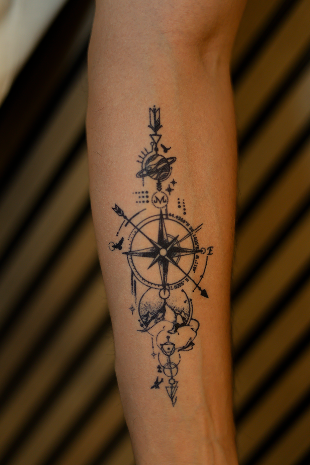
Symbolic objects such as a compass, a weapon, or a hand also work well with this texture because their geometry naturally guides the construction lines: the axis of a compass, the edge of a blade, the outline of fingers. In these motifs, hatching can follow these lines instead of masking them, further emphasizing the shape of the object.
Botanical motifs and other elements of nature work in a similar way, but instead of hard geometry, they have soft, repeating shapes: leaf veins, folds in a petal, layers of bark. Directional hatching can replace a full, smooth shadow fill here, suggesting texture and depth with a few well-placed lines instead of a solid patch of color. This gives even a simple botanical motif the feel of a hand-drawn botanical illustration rather than a sticker with a smooth fill.
How to check sketch texture at its actual size
Dense hatching needs space. When a detailed design is reduced below a certain limit, the individual lines start to compete with one another and, over time – especially after a real tattoo has healed – they can merge; lines that are too thin can even disappear, which is why thicker or medium-weight lines hold up better than very thin ones at small sizes (source: Sortra). The more detail a design contains, the more skin surface it needs to remain legible. This is especially true of areas that are small or sharply curved, such as a finger, wrist, or ankle – there, the same density of hatching that looks good on a forearm may prove too crowded.
Before settling on the size and placement, adjust a temporary version of the design to the intended height, width, and density of the hatching, then apply it to dry skin in the intended spot. Look at it from arm’s length, from across the room, and in the mirror, rather than only on your phone screen, and check how it looks under your usual clothes and while that part of your body moves naturally (source: Beauty of Papers). If you are still wondering how to choose the motif itself, it is worth doing that before testing the size, so you are checking a specific design you have chosen rather than a random example.
This test checks only the size, arrangement of the lines, and how the hatching reads on your skin – it does not predict how real, permanent ink will heal, spread, or change over time, so it is worth testing the design before deciding on a permanent tattoo with that limitation clearly in mind.
Once you know how this loose, drawn texture differs from illustrative and fine-line styles, and how to check it at its actual size, the simplest next step is to browse specific designs in the Illustrative collection and choose the one whose hatching best suits the placement you have in mind.