

A portrait tattoo can be tested on your skin, in the style and size you have in mind, before making any permanent decision. The choice of style—realistic/illustrative rendering, with shadows and tonal gradations, or fine line, with a clean outline and no gradation—changes more than the final look: it changes how much space the design needs, how close you need to be to see how it “works” visually, and what a temporary or semi-permanent version can actually show you about the face you want to wear. If your subject is a pet, not a person, the guide to pet portraits and paw prints covers that case separately, with its own photo requirements.
Before requesting a custom design, the most useful things to clarify are threefold: which style suits the photo you have, what a temporary or semi-permanent test actually demonstrates, and how to prepare a photo an artist can use.
- Style changes the execution, not just the look: realistic/illustrative designs create depth through light and shadow, while fine line conveys shape through outlines, with minimal or no shading.
- A test shows the style, size and placement on your own skin, not the pain or healing process of a permanent tattoo.
- The reference photo determines the quality of the result: resolution, lighting and angle matter more than any later editing.
- Size and placement depend on the style: a detailed portrait generally needs more surface area than a fine-line symbol.
Realistic/illustrative or fine line: what each style actually shows
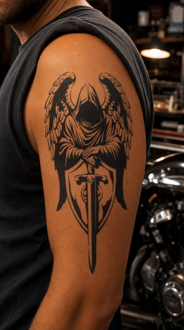
Realistic/illustrative style creates depth through light and shadow, in layers of tone that imitate a photograph (source: Understanding Tattoo Styles: Realism vs. Illustrative Tattoos). The more stylized illustrative version keeps a clear outline and shading that is decorative rather than photographic, relying on composition and symbolism instead of realistic fidelity. Both approaches can depict a portrait, but they differ in how easily the eye can “read” the design from a distance and how labor-intensive it is to execute.
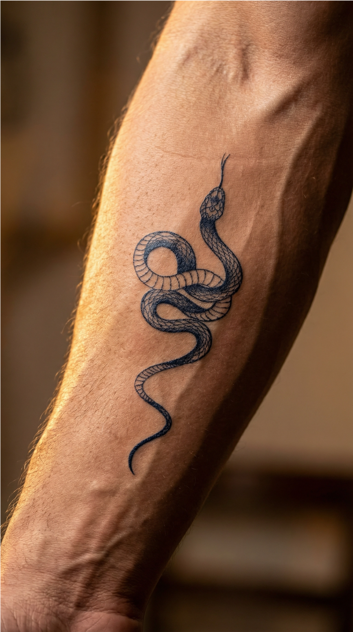
Fine line goes in the opposite direction: it is done with a very fine needle or a small grouping of needles, and the result is a clean outline, usually with minimal or no shading (source: Microrealism vs. Fineline Tattoos: Which Style Is Right for You?). It is the right style for symbols and simple shapes, not necessarily for a portrait that needs tonal gradations to work visually. Micro-realism, on the other hand, uses multiple fine layers of ink to simulate light and shadow, much like a tonal drawing, unlike fine line, which relies on outlines rather than tonal gradations. In practice, this kind of gradation needs space to remain legible once applied to skin, which is why a detailed portrait tends to require more surface area than a simple fine-line symbol.
Example: an illustrative design with shading
As an example of a prepared test, not a prediction of any particular portrait, The Beauty of Rebirth shows how a shaded composition reads on skin—a butterfly rendered with tonal gradations, not just an outline. It is useful for seeing, before requesting a custom design, how an approach closer to realistic/illustrative style works visually at a medium size.

Example: a fine-line design
At the opposite end of the spectrum, Compass 2 is rendered entirely in outlines, without tonal gradation—the kind of execution you choose when you want a symbol that reads quickly, not an image with photographic depth. For more examples in this style, you can browse the fine-line tattoo collection or the guide to fine-line style.

What a temporary or semi-permanent version can and cannot show
A temporary or semi-permanent version shows you exactly what you need to decide before taking a permanent step: how the eye reads the chosen style, what size works on the area of your skin, and how the placement looks. That is also why it is worth testing a design before making it permanent—you see the result on your own body, not just on a screen.
What it does not show is the physiological process of getting a permanent tattoo. The pain at the time of application, the stages of skin healing, the risk of an allergic reaction to permanent tattoo ink, and exactly how the color will settle and age under the skin remain unknown from a temporary or semi-permanent test, because these depend on the artist’s technique, the permanent pigment used and your own skin’s reaction, not on a test design. The ink used for semi-permanent versions also works differently from permanent tattoo ink; the mechanism by which it develops and fades explains why its long-term behavior cannot be extrapolated to a permanent tattoo.
What remains very useful, however, is this: a design that is already prepared, whether illustrative or fine line, helps you choose a stylistic direction and see how the composition works on your skin, even if it does not reproduce a particular face photographically. Photos of a child or of a loved one who is no longer alive deserve to be treated discreetly, without a promotional tone—the choice remains, first and foremost, a personal one.
How to prepare a usable reference photo
A good portrait on skin starts with a photo the artist can read clearly, not with a beautiful image on social media. The file’s original resolution matters more than its composition: enlarging a blurry or compressed photo does not add detail; it only magnifies the existing blur (source: How to Take a Good Reference Photo for a Tattoo). Send the original file from your phone or camera, not a screenshot or a capture from a conversation.
Lighting makes just as much difference. Soft, diffused natural light coming from a single direction—a window during the day or open shade outdoors—shows the natural contours of the face much better than direct flash or harsh overhead light, which flattens features or creates harsh, unnatural shadows.
The angle and expression complete the picture. A straight-on shot at eye level, or a slight three-quarter angle with both eyes visible and the subject filling the frame, gives the most accurate reading of facial proportions (source: How to Choose the Best Reference Photo for a Portrait Tattoo). A calm, natural expression tends to age better visually as a tattoo than a very animated expression captured in a split second.
Size and placement for a portrait-style design
The choice of style directly affects the decision about size. Areas with more taut skin and good visibility—the forearm, thigh or shoulder blade—help make the details of a realistic/illustrative style easier to read, because tonal gradations need space to remain legible. A fine-line symbol, without the same need for tonal depth, adapts more easily to small or discreet areas, such as the wrist or ankle. For a more detailed comparison of available sizes, the guide to choosing the right size covers small, medium and full-body options.
Before requesting a custom version, the simplest test is to first try a design that already exists, from the same stylistic family, and see how it feels on that area of your body. Only once the stylistic direction and placement are clear does a discussion about a custom design based on your photo have a solid foundation.
Conclusion and next step
Three things are worth clarifying before making any permanent decision about a portrait: the style (realistic/illustrative, with shadows and depth, or fine line, with a clean outline), the real limitations of a temporary or semi-permanent test, and a properly prepared reference photo—original resolution, soft natural light, a straight-on or three-quarter angle, and a calm expression. Once these three things are settled, the real customization options become much clearer, and you can talk with an artist from a concrete starting point, not a vague idea.