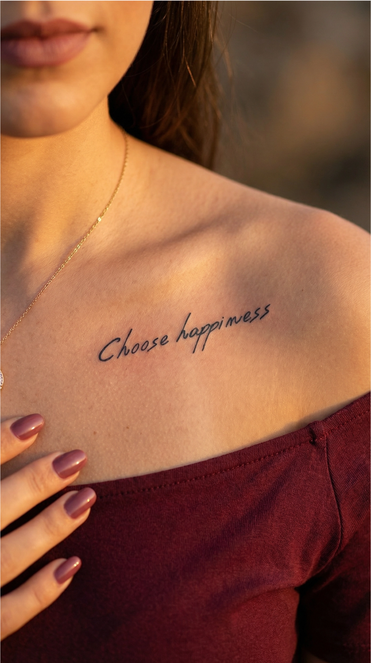


A name tattoo stays legible for a long time mainly because of three decisions made before it reaches the skin: the lettering style you choose, the actual size of the characters, and the area you choose for placement. Because a name consists of just a few thin letters with curves close together, any compromise in these three choices shows quickly, unlike in a more detailed design, where a small variation in a line goes unnoticed in the overall composition. The text below goes through, step by step, how to choose a lettering style that holds up over time, how small the letters can be without merging, how to add a symbol or a date without crowding the name, and which areas keep the design legible for the longest time.
- A script with lots of loops and fine connecting lines looks spectacular on paper, but the thin connecting lines are the first to fade on skin.
- Tattoo lettering gradually spreads after healing, so the spacing between the letters needs to be opened up a little compared with the digital version of the font.
- A symbol or date added next to a name has its own size requirements and is treated separately, not as part of the same block of letters.
- Wide, flat areas of the body keep a name legible for longer than the wrist or fingers.
Why lettering matters more than it seems for a name tattoo
A name is a short string of letters, and letters have fine strokes and curves close together, so any decision about the lettering style becomes visible immediately. In a more complex design, a small variation in a line or in the spacing gets lost in the overall composition; in a name, the same variation changes how the word reads. A font that looks elegant printed on paper or displayed on a phone can look completely different when reduced to just a few centimeters of skin, where thin lines no longer have the clarity of a high-resolution screen. On top of all this, there is a factor few people consider at first: legibility on the day of application does not guarantee legibility ten years later, because the lines of a permanent tattoo do not stay exactly as thin as they were when first applied.
Lettering styles for a name: calligraphic, simple script, or block letters
Calligraphic scripts, with lots of loops and fine connecting lines between the letters, look spectacular on a page or screen, but those thin connecting lines are the first to fade and can merge over time. A simpler script, with more consistent line weight and more open spacing between letters, preserves the shape of the name much better over the years. Block letters or serif letters lose some of the elegance of handwriting, but hold up better when the name has many letters or is accompanied by a second word, such as a date. Tattoo lettering guides recommend judging a font by how it will look in a few decades, not just by how it looks on the day of application (source: Mantle Tattoo). None of these styles is “wrong” in itself; the choice depends on how many letters the name has, the area you choose, and how much the handwritten look matters to you. A tattoo artist can confirm the exact minimum height and line weight suitable for the chosen font before the design reaches the skin.
How small can the letters be before they become illegible?
Tattoo lines do not stay exactly as thin as they were when applied. Specialist guides show that lettering lines widen by approximately 10-20% in the first year and continue to soften slightly after that, which explains why fine, tightly spaced scripts are the first to merge (source: AI for Tattoo). For this reason, when the letters are small, the spacing between them needs to be opened up by around 5-15% compared with the digital version of the font, so they have room to expand without sticking together. The same guides also link the recommended minimum height to the body area: a smaller area, such as the collarbone, calls for letters a little taller than the available space might intuitively suggest, while an area exposed to constant friction, such as the fingers, calls for even taller letters because daily wear from using the hands affects them faster than it does a protected area. These thresholds are guidelines, not guarantees: they depend on the tattoo artist, the area you choose, and each person’s skin.
Another technical risk arises when the ink is introduced too deeply into the skin, beyond the dermis, into a thicker layer beneath the skin; this phenomenon is known as “blowout” and causes fine lines to spread and fade more quickly. Areas with thinner skin, such as the inside of the arm or the top of the foot, are more exposed to this risk (source: Healthline). This phenomenon is strictly related to the technique used for a permanent tattoo with a needle; InkLabs temporary and semi-permanent tattoos do not introduce ink beneath the skin and are not exposed to this risk, but it is worth knowing about as part of the decision about a permanent name tattoo.
How to incorporate a symbol or date with the name
The first step is to decide which element is the main feature. If the name is the centerpiece of the design, any added symbol, whether a heart, a small flower, or a date, needs to be kept simple so it does not visually compete with the fine lines of the letters. A highly detailed symbol next to an already fine script can crowd that area and speed up the merging of the lines over time, exactly the phenomenon described above. A date written in numbers has a different legibility threshold from a name made of letters, so the two are treated separately when choosing the size, not as one continuous block of text. A horizontal format, wider than it is tall, leaves room for both the name and a small symbol below or beside it, without needing to shrink the letters below the legibility threshold discussed above.
If you intend to use someone’s actual handwriting, rather than a typographic font, the mechanics are different and are covered separately in the guide to handwriting tattoos. And if the name is just one of several words you are considering, along with a quote or a short phrase, you can explore a wider range of ideas in quote and word tattoos.
Where to place a name tattoo so it lasts
The wrist is a popular placement for a name, but its small surface limits how large the letters can be, and the area is often exposed to washing and the sun. Fingers fade the fastest of all areas because of constant friction, so a name there has the lowest threshold for long-term legibility. Wider, flatter areas, such as the forearm, ribs, shoulder blade, or ankle below the shoe line, provide room for slightly larger letters and distort less with movement, which directly helps legibility (source: InkedWith).
The same ranking of high-friction areas versus low-friction areas also applies to InkLabs semi-permanent tattoos: hands and fingers fade the fastest, while the arm, ribs, shoulder blade, and ankle last the longest, as explained in detail in the article about how long a semi-permanent tattoo lasts. If you are hesitating between several sizes for the design itself, the temporary tattoo size guide compares small, medium, and full-body options in detail.
How to check the size and placement before it’s permanent
No screen preview shows exactly how the eye reads a particular font at a particular size on the curve and tone of your own skin. A temporary tattoo gives you the chance to see the actual spacing, letter size, and placement before making any permanent decision. The test shows only the chosen design, size, and placement; it does not simulate pain, the healing process, allergy risk, or the exact look of a healed permanent tattoo, because the application method is completely different.
If you want to see your exact name, with your chosen font and spacing, transferred onto a temporary design, the actual customization options, from handwriting to the size and shape of the area covered, are explained in the guide to custom temporary tattoos.
For now, to see what a short word written on skin looks like in practice in two different styles, here are two designs already available from the words and messages range:


The same principles of spacing and line weight discussed above also apply to a custom name. Once you have settled on the font, size, and area for your own name, the next step in the technical preparation of the file for a custom tattoo is explained in the guide to preparing the design.
Conclusion
A name holds up well over time as a tattoo when the lettering style, letter size, and placement area are considered together, rather than chosen separately. A simple script or block letters usually hold up better than a calligraphic style full of loops, the letters need slightly more open spacing than in the digital version of the font, and a symbol or date should be sized so it does not compete with the fine lines of the name. Wide, flat areas of the body give the design the best chance of staying legible for a long time. Testing this exact combination on your own skin with a custom temporary tattoo is the only way to see the result before making a permanent decision.