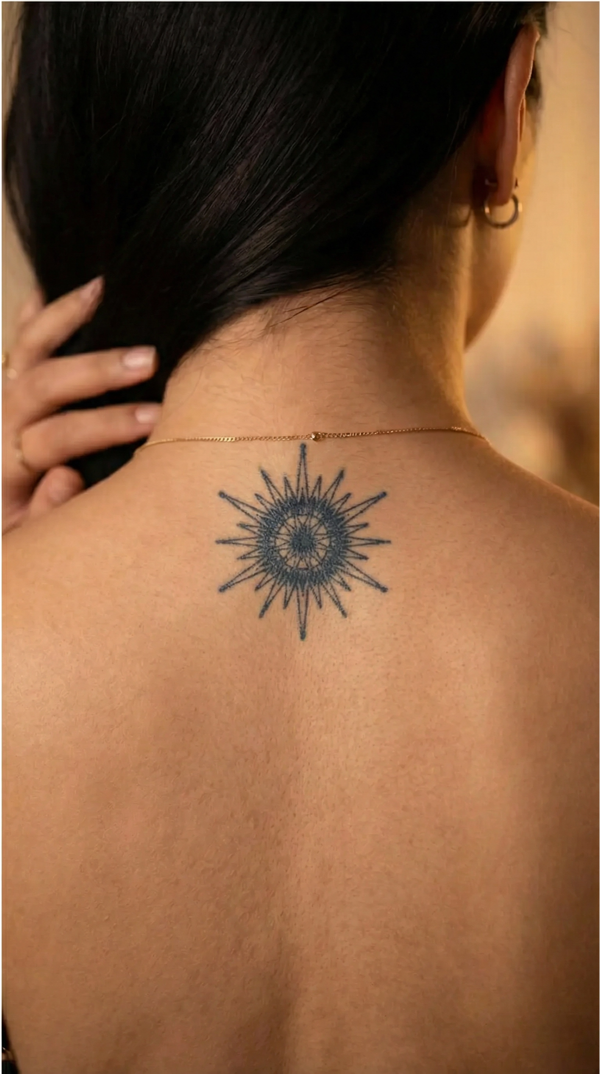


A word or short sentence tattooed on the wrist, ankle, or neck calls for three decisions, in this order: choose the text before thinking about the placement, choose a simple font that stays clear at a few centimeters wide, then check how much space that area actually has. For the neck, this check matters twice as much, because the designs verified in this guide are not intended for that area, according to their own instructions, so the section about it points you to another placement guide instead of repeating the same wrist or ankle designs.
- Single-word designs or short quotes are printed on a panel of approximately 5.5 x 5.5 cm, so that is the practical text limit before the letters start crowding each other.
- Placement matters more than the font you choose: the wider, more stable ankle can accommodate a slightly longer sentence than the narrow, mobile wrist.
- The neck remains an exception among the designs discussed here: their instructions explicitly exclude the face, lips, eyes, neck, upper chest, and irritated or scarred skin.
- The most common mistakes are missing or incorrect diacritics and mixing languages without using a consistent punctuation style.
- The color develops fully in approximately 24 hours, and the design normally lasts up to 15 days, depending on hydration, friction, and how active the area is.
How to choose the right word or sentence
A single word and a short sentence do not communicate in the same way. A word on its own works as a visual reminder, something you recognize at a glance without actually “reading” it. A sentence of a few words asks a little more time of the viewer and, in return, can convey a more complete idea. The choice depends on what you want to keep with you: an anchor word or a whole thought.
Text stays meaningful over time when it is specific to you, rather than a generic formula you have seen on dozens of arms. A memory, a phrase said by someone in particular, or a word connected to a specific moment holds up better when faced with the question “why did you put that there?” than a generic motivational slogan.
If you start with a favorite quote in another language, translate it into Romanian with the meaning in mind, not word for word. A literal translation can sound unnatural or even change the original nuance; it is easier to rephrase the idea in natural Romanian than to force a borrowed construction.
Fonts that stay legible at a small size
At just a few centimeters wide, a very thin script font can visually become a single continuous line, especially from a distance or on textured skin. Letters that sit very close together and have lots of loops are the first to get lost.
A pattern of simple, evenly spaced lines, like the fine-line and minimalist styles in the catalog, holds up better at a small size than ornate cursive, precisely because each letter remains visually separate from the one next to it.
The contrast between the ink color and your skin tone also affects how easy the text is to read after the first day, when the color has reached its final shade. Stronger contrast helps with legibility, especially for thin fonts, where the edge of each letter matters.
The right length for each area (table)
The single-word designs or short quotes in the collection are printed on a panel of approximately 5.5 x 5.5 cm. This fixed size effectively determines how many characters fit without the letters touching, regardless of the placement. What changes from one area to another is the available width and how much the skin underneath moves or curves.
| Area | Available width (approximate) | How the skin behaves | What this means for the text |
|---|---|---|---|
| Wrist | a narrow strip, a few centimeters wide | mobile area that creases with every hand movement | a single short word fits comfortably on the approximately 5.5 x 5.5 cm panel without looking cramped |
| Ankle | wider than the wrist, following the ankle bone | curved, but more stable at rest than the wrist | a short sentence of a few words can stay legible if it follows the line of the bone |
| Neck | varies by placement (side, under the ear, nape) | delicate skin, close to hair, collars, and jewelry | the designs verified in this guide are not intended for this area; for the neck, check the instructions for your chosen design and the dedicated placement guide |
On a wider, more stable area, a phrase of a few words is easier to read than on a narrow, mobile one, simply because the letters have room to breathe instead of bunching up with every movement of the joint underneath.
The wrist: short words, visible or discreet
The inner wrist is more discreet, visible mainly when you turn your hand palm-up; the outer wrist is visible by default whenever your hand moves naturally. The choice between the two depends on how often you want the text to be noticed during the day.
For the wrist, a short word is the best fit for this area’s narrow, flat strip, precisely because the space across it is limited by the joint’s bend. One example from the collection shows how a simple, unadorned word works in this placement.

If you want more wrist design ideas beyond lettering, the dedicated wrist tattoo guide also covers designs without text.
The ankle: how lettering works on a curved area
The ankle has a curve shaped by the bone itself, so a sentence is easier to read if it follows the line of that bone instead of running straight across it. The design adapts to the area’s natural shape, not the other way around.
Repeated friction from shoes or socks, along with skin hydration and activity level, are among the factors that affect how long the design stays visible here, just as they do on any other area exposed to constant contact.
Because the ankle offers more width than the wrist, a slightly longer sentence can stay visually clean without bunching up. One design from the collection illustrates this with short, fine-line text.

For more placement ideas for this area, the ankle tattoo guide also covers designs without text.
The neck: what to know before choosing this area
The neck is a popular area precisely because text can be so visible there, whether on the side, under the ear, or at the nape, where it can be easily hidden by your hair when you want it to be. Adjustable visibility is the main reason many people consider this area for lettering.
The instructions for the designs shown above, Hope and Choose Happiess, explicitly exclude the face, lips, eyes, neck, upper chest, intimate areas, irritated or damaged skin, and areas with scars or stretch marks. For this reason, these two designs are not recommended for the neck, and this section is for information only, not a suggestion to use them there. Other designs in the catalog may have different instructions, so always check the product page for your chosen design before applying it.
For actual placement on the neck or behind the ear, the dedicated guide for this area explains how to prepare the skin, including cleaning the area of hair products, oil, or perfume before application, and protecting the fresh design from friction from collars or hair during the first few hours, as well as placement options suited to a design made specifically for the neck.
Common spelling and punctuation mistakes in lettering tattoos
Incorrect or missing diacritics are the most common problem: the correct Romanian forms of ș and ț have a comma underneath, not a cedilla, and some fonts or keyboard layouts automatically change the mark to the wrong one or remove the diacritics completely, sometimes changing the word’s meaning. Check exactly how the letters look in your chosen font before confirming the design, not after applying it.
Another common pitfall is mixing a Romanian phrase with an English word without deciding in advance on a consistent approach to language and punctuation. The result can look unfinished, especially at a small size, where every letter stands out.
Finally, check the design from the angle you will actually see it, especially near a joint such as the wrist or ankle: text that looks correct on screen can appear reversed or hard to read when you look at your own hand or foot from an unusual angle.
How long it lasts and how the color develops
The design starts out a lighter shade and reaches its final, darker color in approximately 24 hours as the ink reacts with the skin. Wait for this period before judging how intense the text really looks.
InkLabs semi-permanent tattoos normally last up to 15 days, and the exact duration depends on skin hydration, friction, and the activity level of the area. Hands and fingers fade fastest among the usual placement areas, while the arm, ribs, shoulder blade, and ankle generally last longer; the wrist is not listed separately in this comparison, so it is reasonable to expect wear somewhere between the two extremes, closer to the hands because the joint moves frequently.
Application takes approximately 1-2 minutes: exfoliate the area for about 30 seconds, remove the protective film, press the design adhesive-side down onto the skin, wet the surface thoroughly for approximately one minute, then peel off the backing paper. The steps are the same regardless of placement, but they are worth repeating with extra care on a curved area such as the ankle, where the design needs to be pressed evenly across the entire surface.
Once you have decided on the word, font, and placement, the easiest next step is to test the size and font directly on your skin before choosing a final design. Browse the complete Temporary Lettering Tattoos collection for more short word and quote options, or read the general guide to quote and word tattoos if you want more wording ideas. For lettering on the hand and forearm designed for a male audience, this dedicated guide covers that area separately, while for the collarbone, the collarbone tattoo guide covers a neighboring area with its own rules for length and curvature.